6.4. Scatter plots#
Scatter plots can be produced using the plt.scatter() function.
plt.scatter(x, y, color=colour, marker=marker)
Where x and y are one-dimensional co-ordinate arrays and colour and marker are characters specifying the colour and marker used for each point (see Table 6.1).
To demonstrate this enter the following code into your program.
# Scatter plot
x = np.random.rand(100)
y = np.random.rand(100)

fig, ax = plt.subplots()
plt.scatter(x, y, color='r', marker='o')
plt.xlim(0, 1)
plt.ylim(0, 1)
plt.xlabel('$x$')
plt.ylabel('$y$')
plt.show()
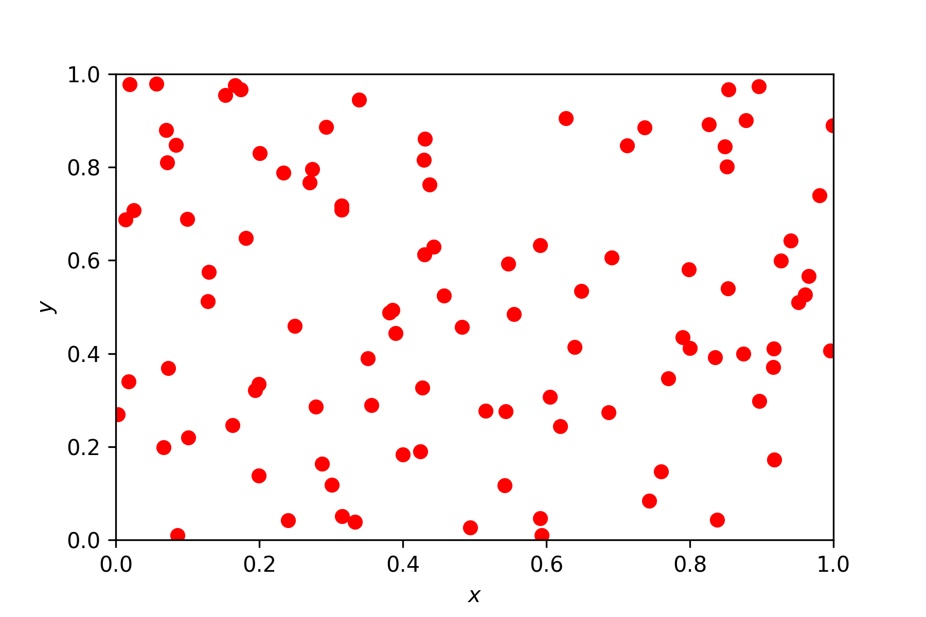
The np.random.rand() function generates an array of 100 random numbers in the range \([0, 1]\). Run your program and you should see a plot similar to the one below added to the Plots pane (note that yours will look slightly different to this one due to the random numbers generated).

6.4.1. Exercises#
Exercise 6.5
Produce a scatter plot using the arrays x and y given below. Format your plot so that the points are plotted using blue diamonds and the axes are scaled so that \(x,y \in [0, 1]\).
x = np.array([ 0.1734, 0.3909, 0.8314, 0.8034, 0.0605, 0.3993, 0.5269, 0.4168, 0.6569, 0.6280 ])
y = np.array([ 0.0717, 0.1665, 0.7881, 0.5486, 0.0702, 0.2382, 0.3031, 0.2341, 0.4335, 0.4265 ])
Exercise 6.6
We can calculate a line of bets fit for the data from Exercise 6.5 using a linear regression model \(y = mx + c\) where \(m\) is the slope of the line and \(c\) is the \(y\)-intercept. To compute \(m\) and \(c\) we can rewrite the linear model as \(\vec{y} = A\vec{p}\) where \(\vec{y} = (y_1, y_2, \ldots, y_n)^\mathsf{T}\), \(\vec{p} = (m, c)^\mathsf{T}\) and
We then solve for \(m\) and \(c\) using the NumPy command np.linalg.lstsq() which calculates the least squares solution which minimises the difference between the points \((x_i,y_i)\) and the line \(y=mx+c\).
m, c = np.linalg.lstsq(A, y, rcond=None)[0]
Calculate the line of best fit for the data from Exercise 6.5 and add it to your scatter plot.