13.1. Line Plots#
To plot a simple two-dimensional function we can use the plot() function
plot(x, y)
which plots a simple graph of y values against x values where x and y are one-dimensional arrays. The values of x can be generated using the linspace() function.
x = linspace(start, end, numvals)
This creates an array x with numvals equally spaced values between start and end inclusive. To demonstrate this create a new MATLAB file called M13_Plotting.m, save it in your OneDrive folder and enter the following code.
% 13. Plotting

clear % Clear all variables
clc   % Clear command window

% linspace function
x = linspace(-2, 2, 10)
Run your program and the following should be added to the command window
x =

  Columns 1 through 9

   -2.0000   -1.5556   -1.1111   -0.6667   -0.2222    0.2222    0.6667    1.1111    1.5556

  Column 10

    2.0000
Here x has 10 elements, the first and last elements are -2 and 2 respectively and each element differs from the previous one by \((2 -(-2))/(10 - 1) = 4/9 = 0.\dot{4}\).
Lets create a graph of the function \(y = x^2\). Enter the following code into your program.
% Line plot
x = linspace(-2, 2, 10);
y = x .^ 2;

plot(x, y)
Run your program and a window will pop-up showing the following plot.
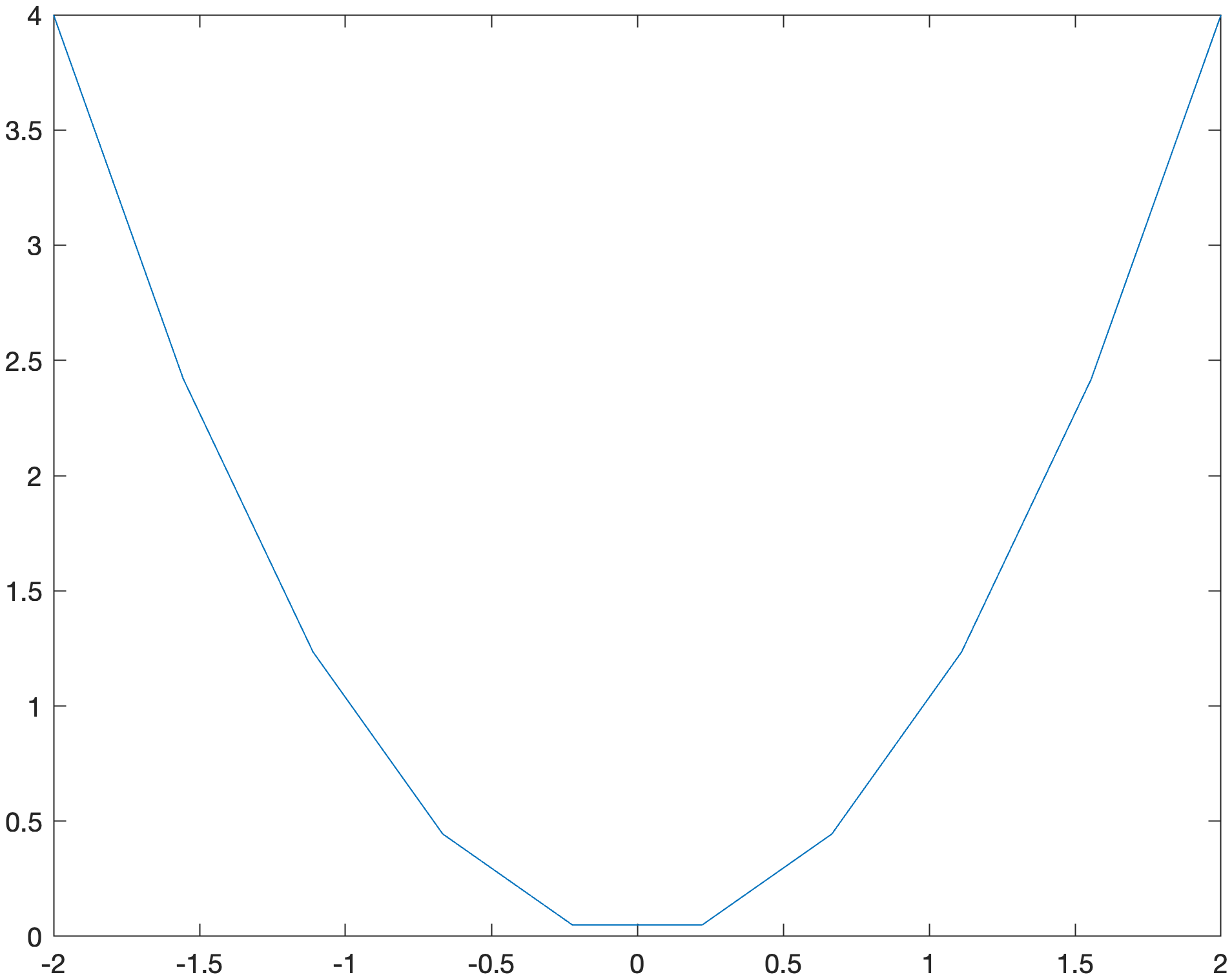
We can see that our line plot appears jagged where is should be a smooth line. This is because we have only generated 10 points in our x array. To make the plot appear smoother we simply increase the number of points that we are plotting. To demonstrate this change your np.linspace() function so that it looks like the following.
x = linspace(-2, 2, 50)
Rerun your program and you should see the following plot appear in the figure window.
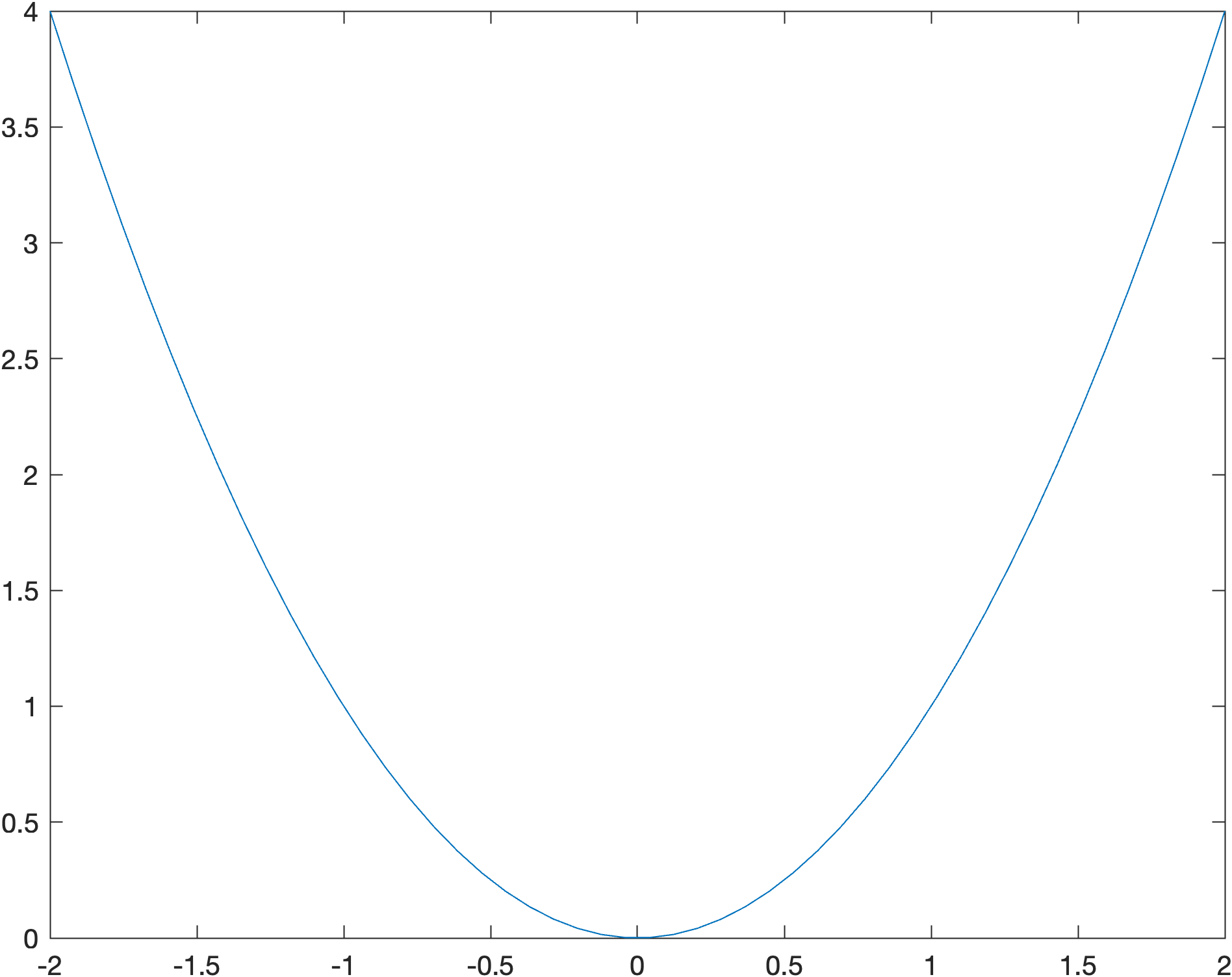
Here we have used 50 points to plot the graph of \(y = x^2\) and the graph appears smoother.
13.1.1. Linespec#
We can change the appearance of a plot by specifying the format after the co-ordinates in the plot() function.
plot(x, y, Linespec)
Where format is a string that specifies the colour, marker and line styles.
Linespec = '[colour][line][marker]'
The characters for some of the marker, line and colour styles are shown in Table 13.1 below.
Colour |
Description |
Line |
Description |
Marker |
Description |
|---|---|---|---|---|---|
|
blue |
|
solid line |
|
point marker |
|
green |
|
dashed line |
|
diamond marker |
|
red |
|
dash-dot line |
|
circle marker |
|
cyan |
|
dotted line |
|
triangle down marker |
|
magenta |
|
triangle up marker |
||
|
yellow |
|
square marker |
||
|
black |
|
star marker |
||
|
white |
|
plus marker |
||
|
x marker |
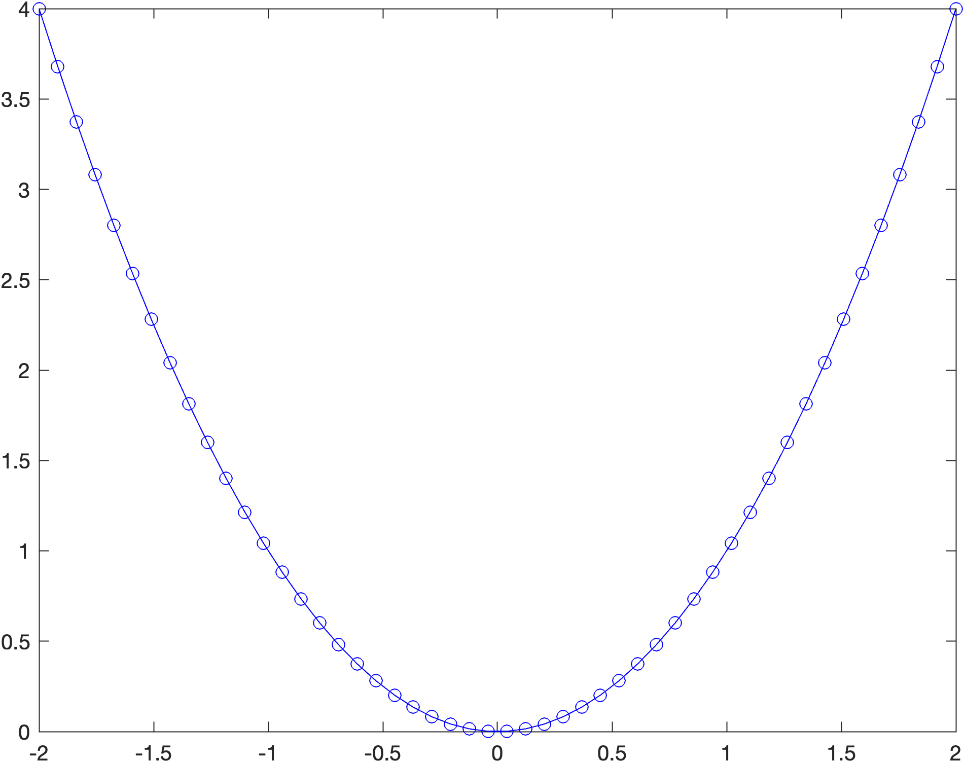
It doesn’t matter what order the characters in Linespec are, e.g., 'r-o' produces the same result as 'o-r'. To demonstrate this lets change our plot so it is plotted using a blue line with a circle marking each point. Change your plot command so it looks like the following.
plot(x, y, 'b-o')
Run your program and you should see the following plot appear in the figure window.
13.1.2. Axis labels and title#
Axis labels and titles can be added to a plot using the xlabel(), ylabel() and title() functions.
xlabel('x axis label')
ylabel('y axis label')
title('plot title')
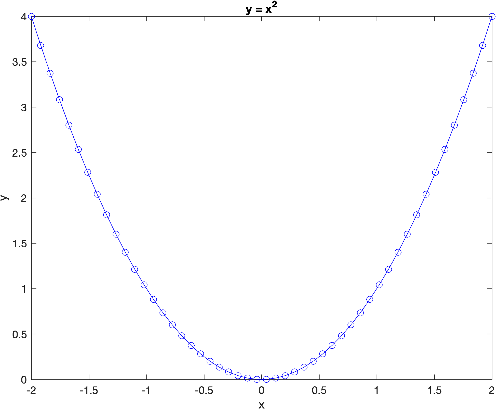
Lets add axis labels and a title to our plot. Enter the following code into your program before the show() function.
xlabel('x')
ylabel('y')
title('y = x^2')
Run your program and you should see the following plot appear in the figure window.
13.1.2.1. Font properties#
We can specify the font properties in axes labels, titles and other plot elements. For example, to set the properties of the \(x\)-axis label we use
xlabel('text', FontSize=size, Color='colour')
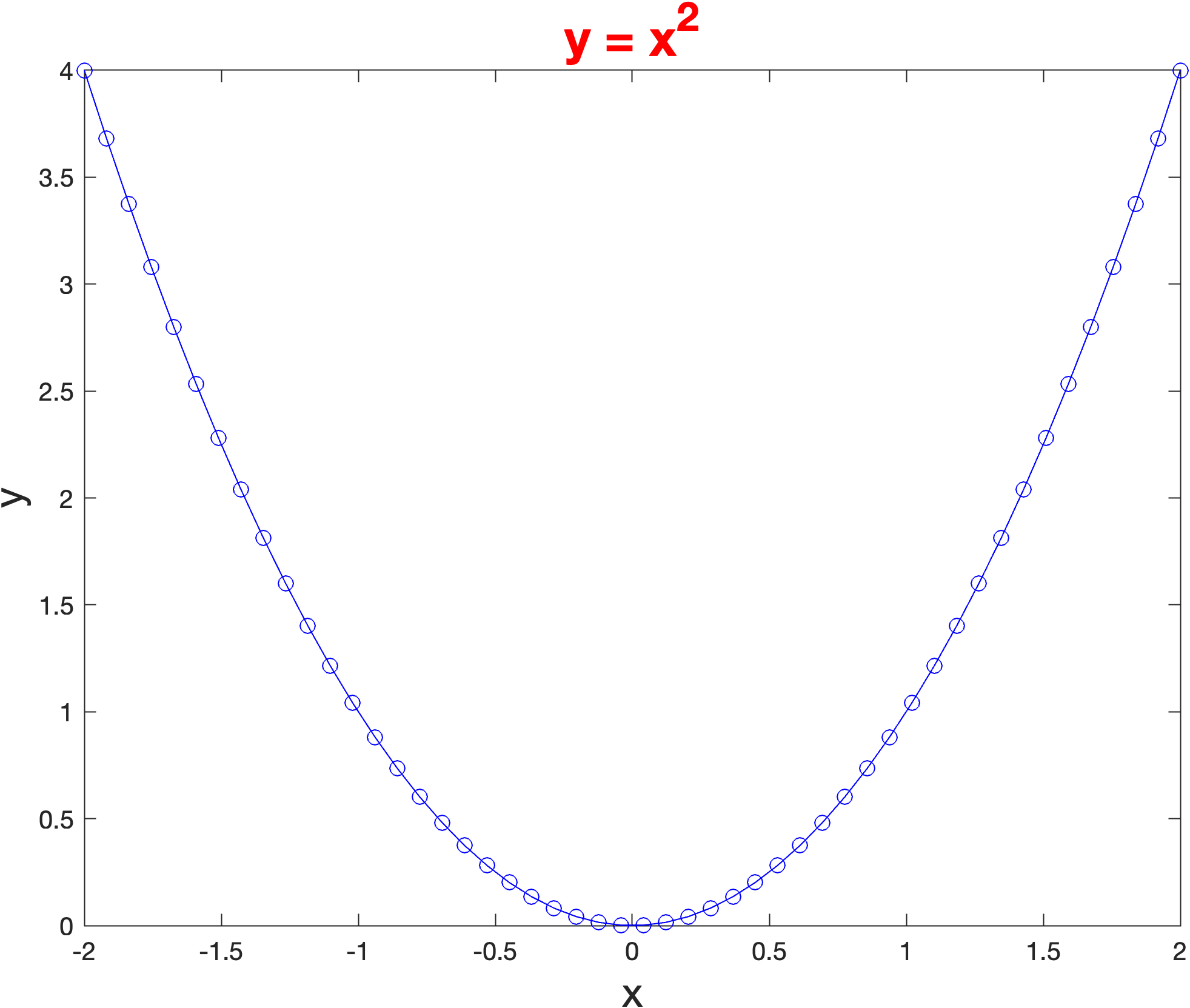
Where 'text' is a string for the text to appear in the label, size is a number for the font size in pt and 'colour' is one of the colours from Table 6.1 (the default font size and colour is 10pt and black respectively). Lets change the font properties of your labels, change your plot commands so that it matches the following.
xlabel('x', FontSize=16)
ylabel('y', FontSize=16)
title('y = x^2', FontSize=16, Color='red')
Run your program and you should see the following plot appear in the figure window.
13.1.2.2. \(\LaTeX\) in labels#
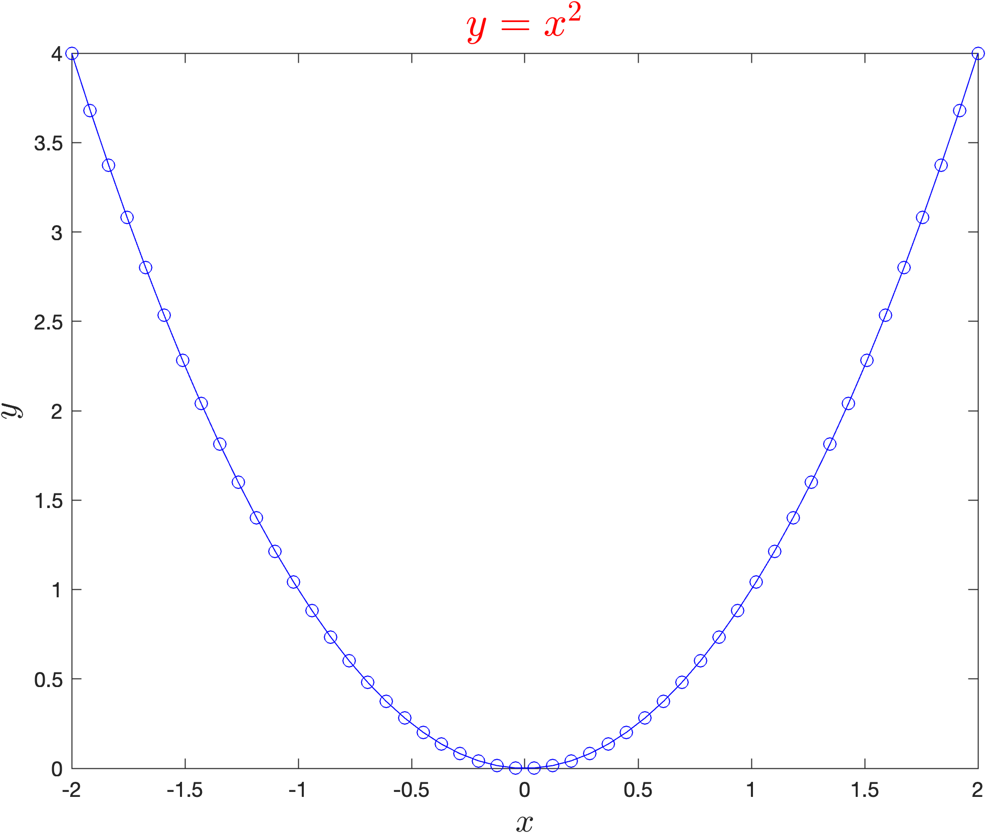
Text in MATLAB plots can by include \(\LaTeX\) equations. To demonstrate this edit your code so that it looks like the following.
xlabel('$x$', FontSize=16, Interpreter='latex')
ylabel('$y$', FontSize=16, Interpreter='latex')
title('$y = x^2$', FontSize=16, Color='red', Interpreter='latex')
Rerun your program and you should see the following plot appear in the figure window.
13.1.3. Saving a plot to a file#
The easiest way to save a plot to a file is to click on File in the figure window and then on Save. This will open up a file browser where you can select the folder and filename of the plot and also the format.
Sometimes we want to be able to save a plot using a command in our program (e.g., we could have a program for generating multiple plots). To do this we can use the saveas() function.
saveas(gcf, filename)
Where filename includes the extension for the image type used. Most common image formats are supported, e.g., png, jpeg, pdf etc., but png (Portable Network Graphics) files are preferred for importing into electronic documents. To demonstrate this enter the following code into your program
% Save plot to file
saveas(gcf, 'my_plot.png')
Rerun your program and you should see the file myplot.png added to the folder that contains your M13_Plotting.m file.
13.1.4. Changing the axes#
13.1.4.1. Setting the axis scale#
The axis scale can be adjusted using the xlim() and ylim() functions
xlim([xmin, xmax])
ylim([ymin, ymax])
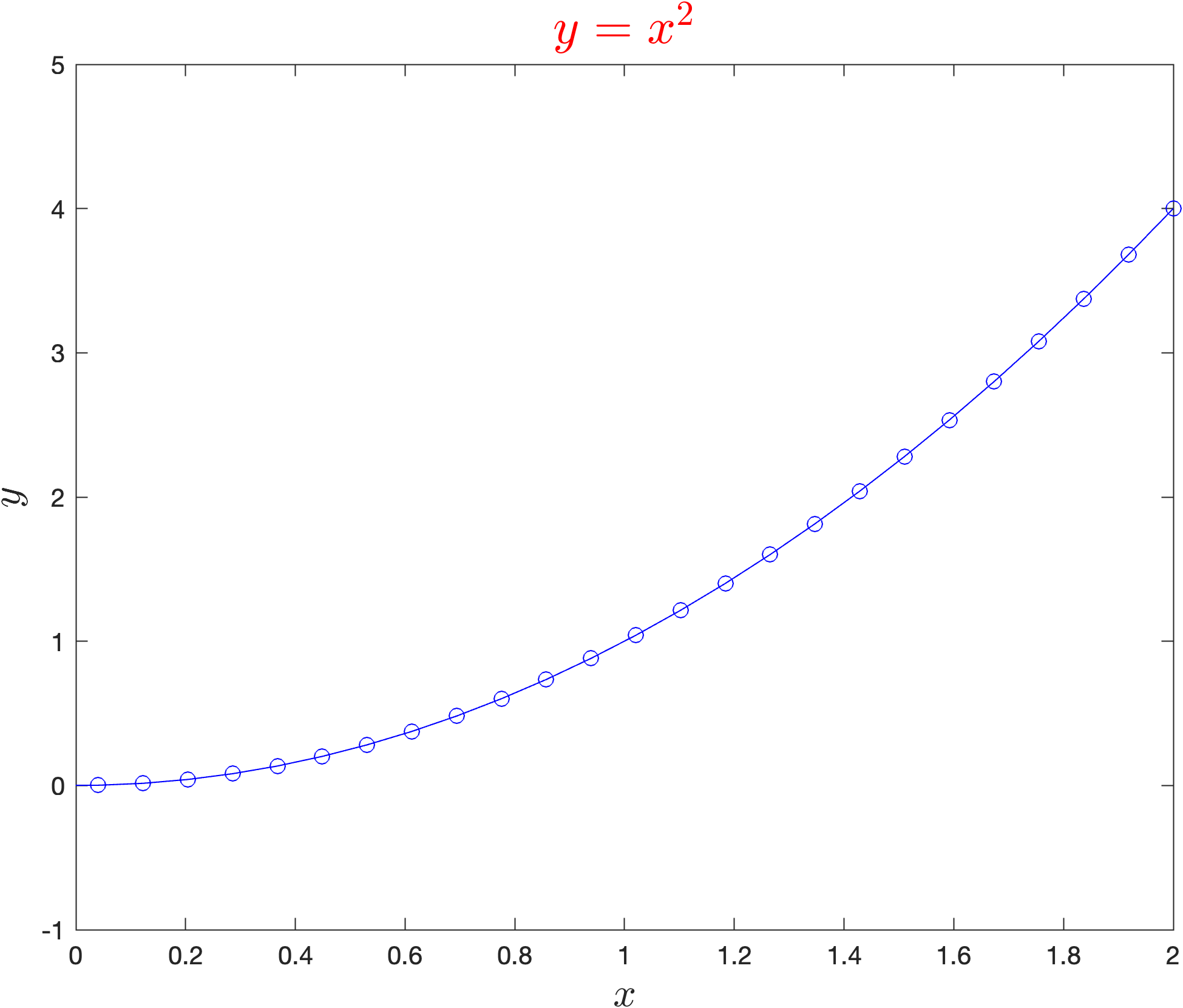
where xmin and xmax are the minimum and maximum value on the \(x\)-axis (and similar for \(y\)). To demonstrate this lets change the axis limits so that the \(x \in [0, 2]\) and \(y\in [-1,5]\). Enter the following code into your program before the show() function.
% Setting the axis scale
xlim([0, 2])
ylim([-1, 5])
Run your program and you should see the following plot added to the plot window.
13.1.4.2. Axes properties#
We can set the axes properties using the axis keyword
axis style
where style is one or more options described in Table 13.2 below.
Value |
Description |
|---|---|
|
fits the axis around the data with a thin margin of padding on all sides |
|
fits the axis tightly around the data |
|
same scaling from data to plot units for the horizontal and vertical directions |
|
uses axis lines with equal lengths |
|
turns off the axes |
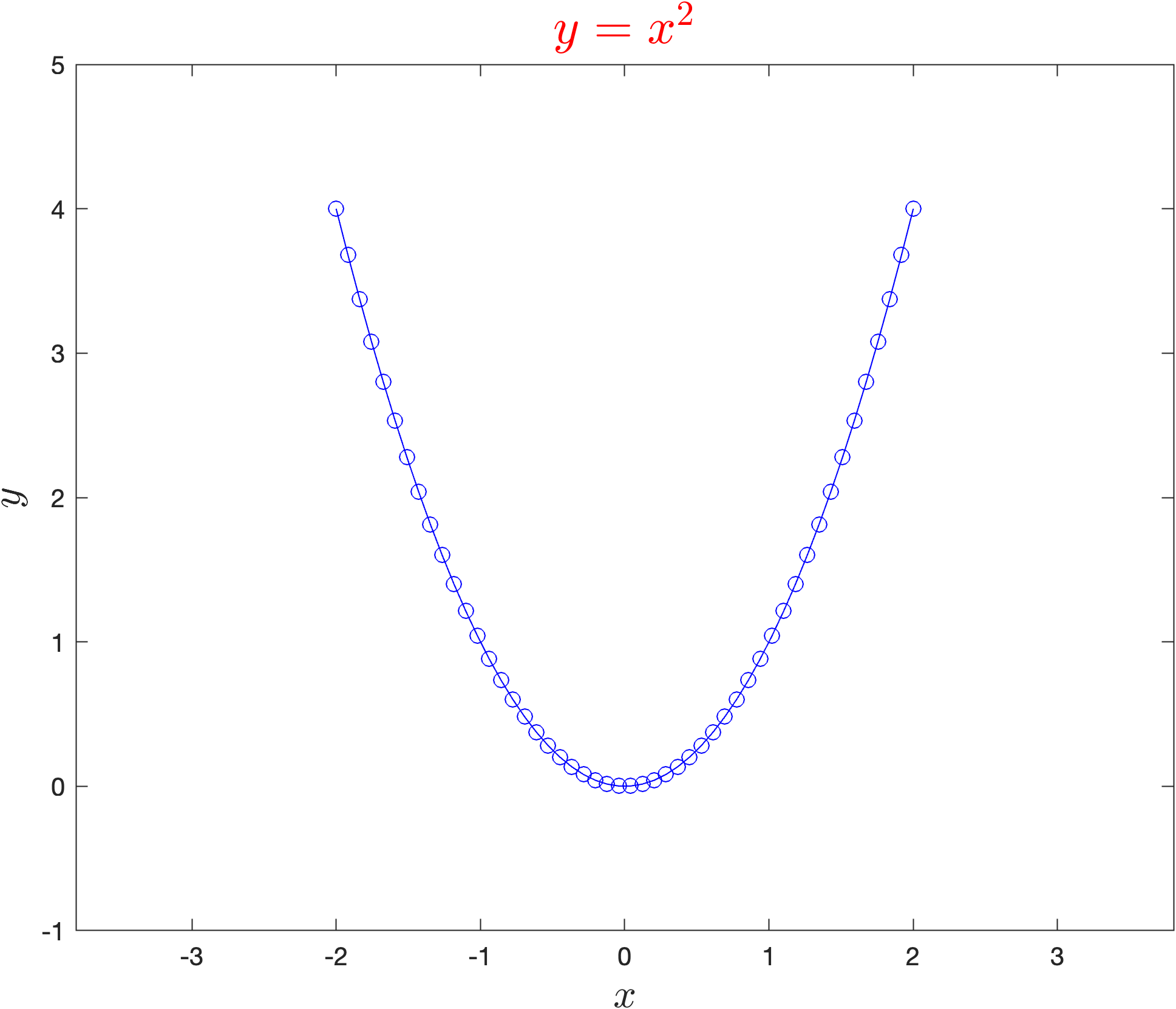
To demonstrate this lets change the aspect ratio so that the the \(x\) and \(y\) axis use equal scaling, enter the following code into your program.
% Axis properties
axis equal
Run your program and you should see the following plot added to the plot window.
13.1.5. Exercises#
Create a new MATLAB file called M13_Plotting_exercises.m and save it to your OneDrive folder. Use it to answer the following exercises.
Exercise 13.1
Produce a plot fo the function \(y = \sin(x)\) with a red line using axes limits \(x\in [0, 4\pi]\) and \(y \in [-2, 2]\).
Exercise 13.2
Produce a plot of the function \(s = 2t^3 + 3t^2 - 8t + 6\) over the domain \(t\in [-4,4]\) using a green line. Scale the \(s\)-axis so that it is in the range \([-50,50]\) and change that aspect ratio to 1/20.