6.2. Line Plots#
To plot a simple two-dimensional function we can use the plt.plot() function.
fig, ax = plt.subplots()
plt.plot(x, y)
plt.show()
The functions use here are:
plt.subplots()- creates a figure object which is a container for all of the plot elements and axis object(s) which is used to specify the axis properties for each individual plotplt.plot()- plots a simple graph ofyvalues againstxvalues wherexandyare one-dimensional arraysplt.show()- command tells Python to display the plot
The values of x can be generated using the the NumPy function np.linspace().
x = np.linspace(start, end, numvals)
This creates an array x with numvals equally spaced values between start and end inclusive. To demonstrate this create a new Python file called 6_Plotting.py, save it in your OneDrive folder and enter the following code.
# 6. Plotting

# The linspace function
import numpy as np

x = np.linspace(-2, 2, 10)

print(x)
Run your program and the following should be added to the console
x = [-2.         -1.55555556 -1.11111111 -0.66666667 -0.22222222  0.22222222
  0.66666667  1.11111111  1.55555556  2.        ]
Here x has 10 elements, the first and last elements are -2 and 2 respectively and each element differs from the previous one by \((2 -(-2))/(10 - 1) = 4/9 = 0.\dot{4}\).
Lets create a graph of the function \(y = x^2\). Enter the following code into your program.
# Line plot
import matplotlib.pyplot as plt

x = np.linspace(-2, 2, 10)
y = x ** 2

fig, ax = plt.subplots()
plt.plot(x, y)
plt.show()
Run your program and you will see that nothing has been added to the console. To view the plot open the Plots pane by clicking on Plots beneath the top-right pane. You should see the following plot.
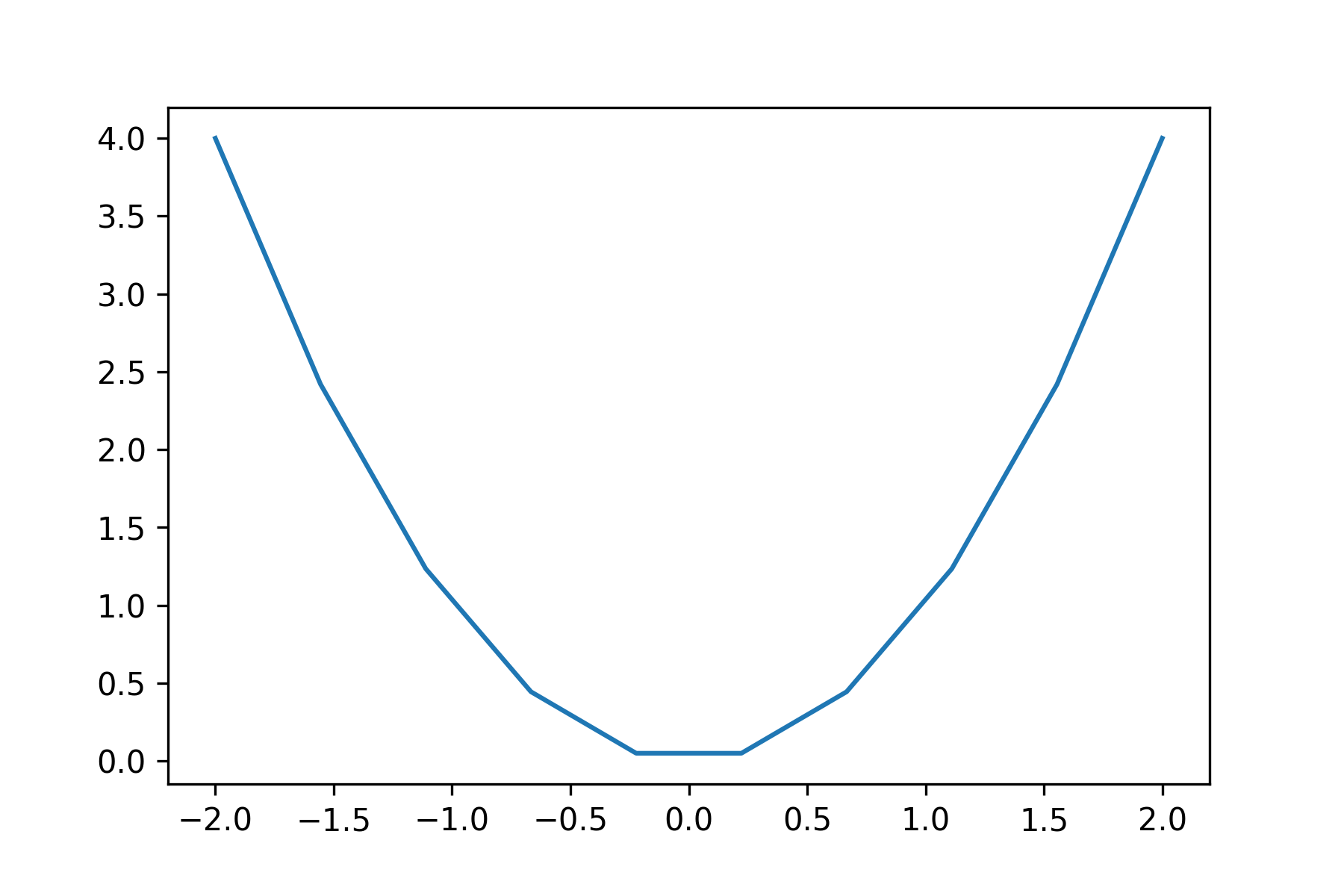
We can see that our line plot appears jagged where is should be a smooth line. This is because we have only generated 10 points in our x array. To make the plot appear smoother we simply increase the number of points that we are plotting. To demonstrate this change your np.linspace() function so that it looks like the following.
x = np.linspace(-2, 2, 50)
Rerun your program and you should see the following plot appear in the Plots pane.
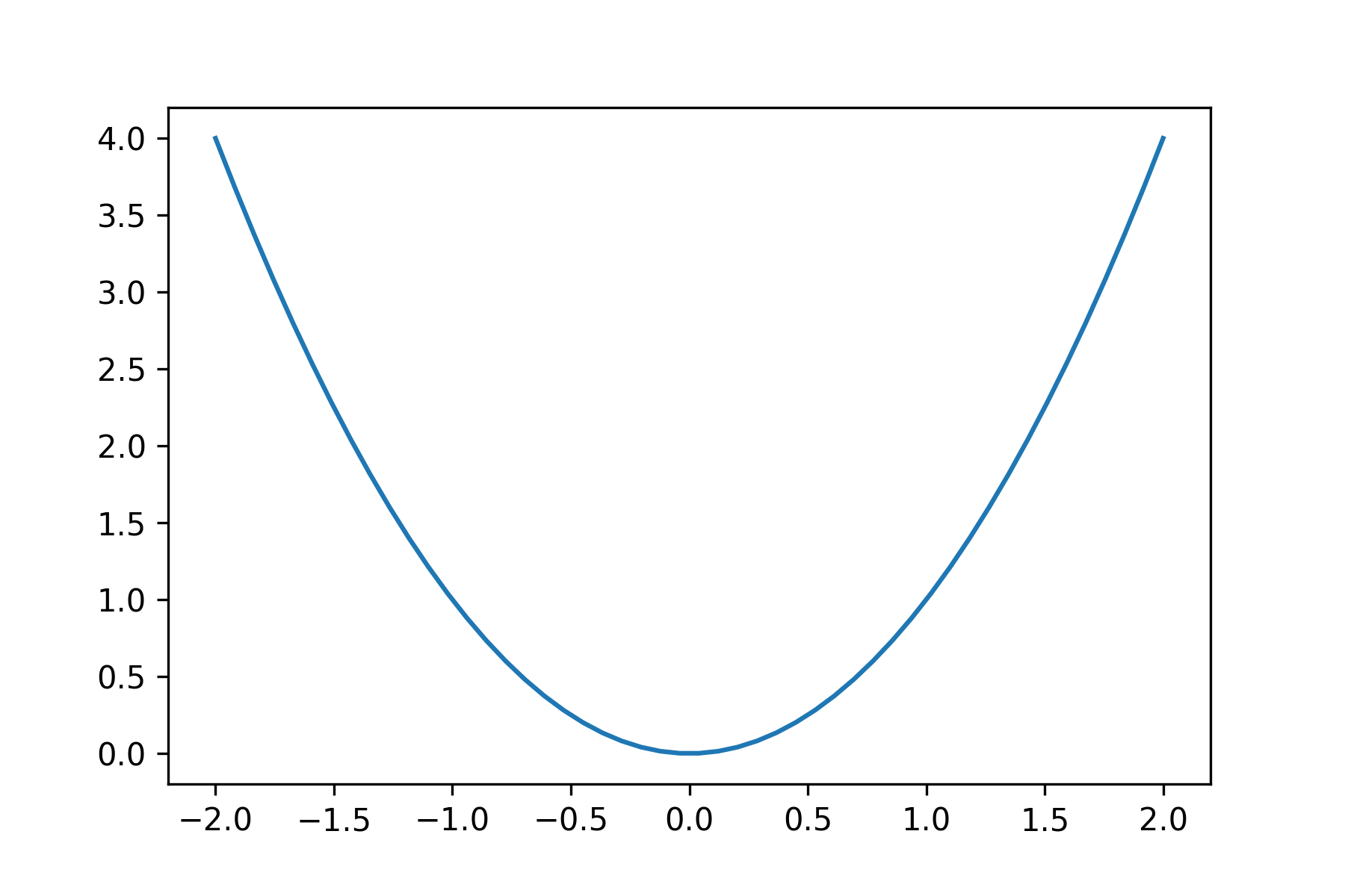
Here we have used 50 points to plot the graph of \(y = x^2\) and the graph appears smoother.
6.2.1. Plot styles#
We can change the appearance of a plot by specifying the format after the co-ordinates in the plt.plot command.
plt.plot(x, y, format)
Where format is a string that specifies the colour, marker and line styles.
format = '[colour][line][marker]'
The characters for some of the marker, line and colour styles are shown in Table 6.1 below.
Colour |
Description |
Line |
Description |
Marker |
Description |
|---|---|---|---|---|---|
|
blue |
|
solid line |
|
point marker |
|
green |
|
dashed line |
|
pixel marker |
|
red |
|
dash-dot line |
|
circle marker |
|
cyan |
|
dotted line |
|
triangle down marker |
|
magenta |
|
triangle up marker |
||
|
yellow |
|
square marker |
||
|
black |
|
star marker |
||
|
white |
|
plus marker |
||
|
x marker |
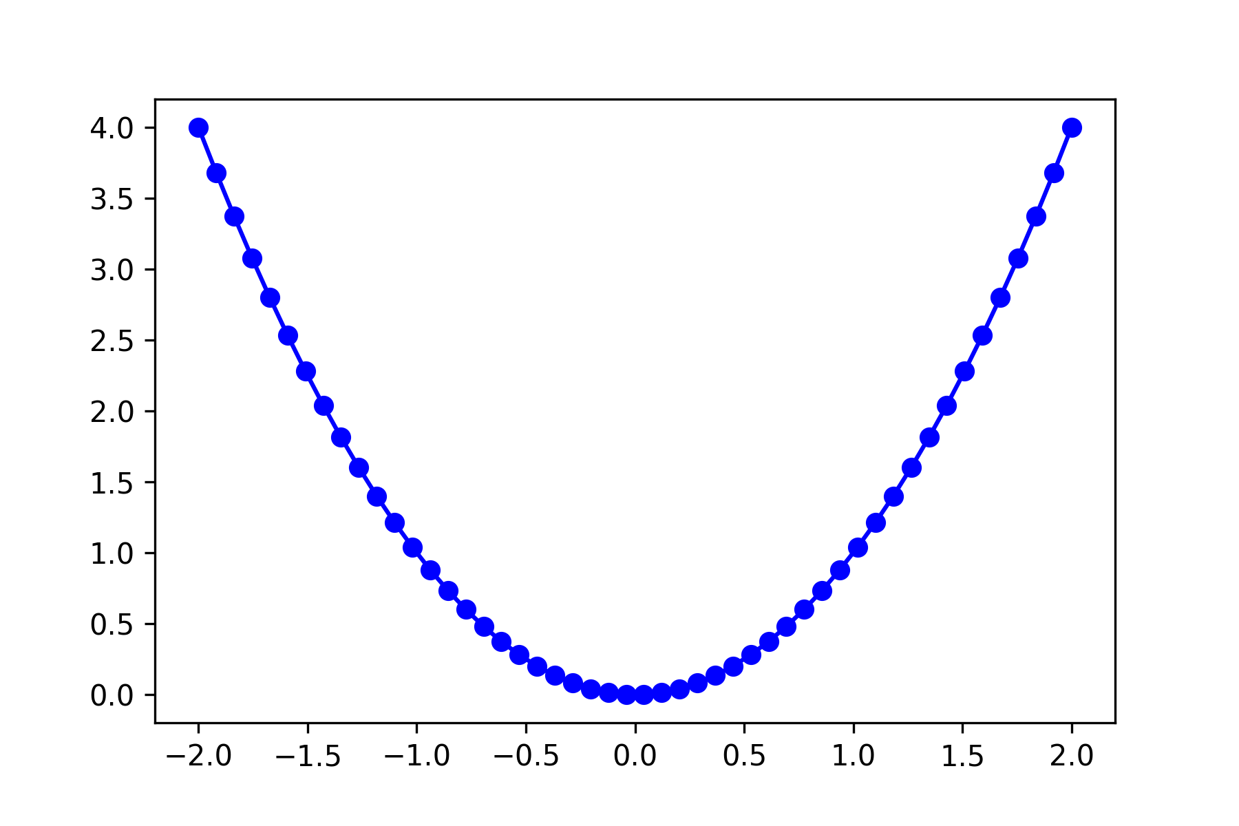
It doesn’t matter what order the characters in format are, e.g., 'r-o' produces the same result as 'o-r'. To demonstrate this lets change our plot so it is plotted using a blue line with a circle marking each point. Enter the following code into your program.
# Plot styles
fig, ax = plt.subplots()
plt.plot(x, y, 'b-o')
plt.show()
Run your program and you should see the following plot appear in the Plots pane.
6.2.2. Axis labels and title#
Axis labels and titles can be added to a plot using the plt.xlabel(), plt.ylabel() and plt.title() functions.
plt.xlabel('x axis label')
plt.ylabel('y axis label')
plt.title('plot title')
Lets add axis labels and a title to our plot. Enter the following code into your program before the plt.show() function.
plt.xlabel('x')
plt.ylabel('y')
plt.title('y = x^2')
Run your program and you should see the following plot appear in the Plots pane.

6.2.2.1. Font properties#
We can specify the font properties in axes labels, titles and other plot elements. For example, to set the properties of the \(x\)-axis label we use
plt.xlabel('text', fontsize=size, color='colour')
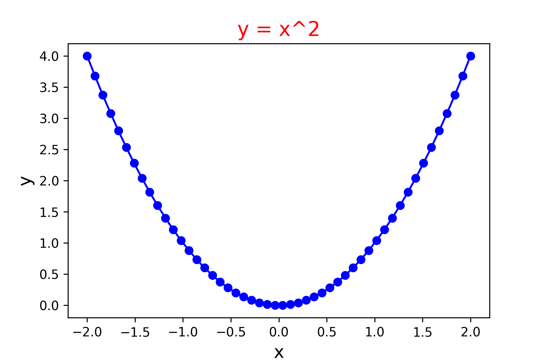
Where 'text' is a string for the text to appear in the label, size is a number for the font size in pt and 'colour' is one of the colours from Table 6.1 (the default font size and colour is 10pt and black respectively). Lets change the font properties of your labels, change your plot commands so that it matches the following.
plt.xlabel('x', fontsize=14)
plt.ylabel('y', fontsize=14)
plt.title('y = x^2', fontsize=16, color='red')
Run your program and you should see the following plot appear in the Plots pane.
6.2.2.2. \(\LaTeX\) in labels#
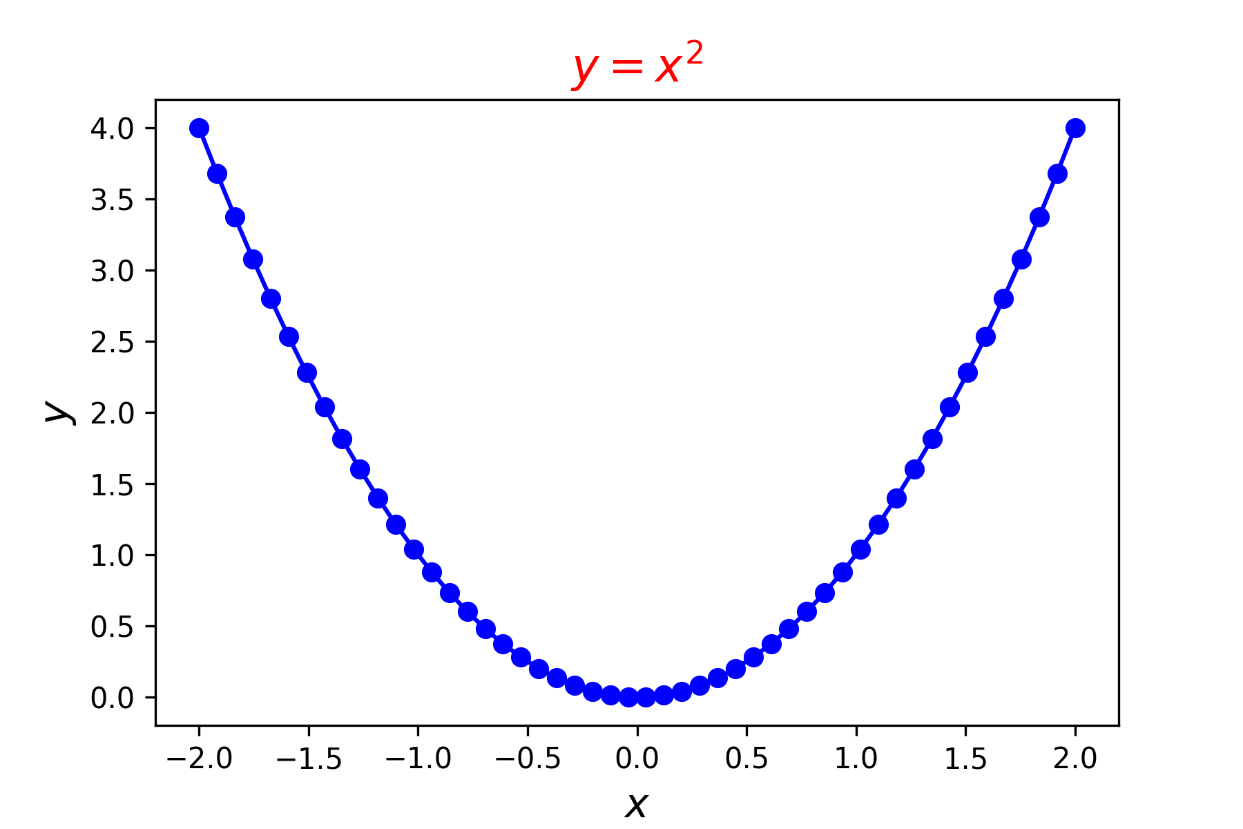
Text in matplotlib plots can by include \(\LaTeX\) equations. Simply surround an equation with dollar signs $...$ renders it using \(\LaTeX\). To demonstrate this edit your code so that it looks like the following.
plt.xlabel('$x$', fontsize=14)
plt.ylabel('$y$', fontsize=14)
plt.title('$y = x^2$', fontsize=16, color='red')
Rerun your program and you should see the following plot appear in the Plots pane.
6.2.3. Saving a plot to a file#
The easiest way to save a plot to a file is to right-click on the plot in the Plots pane and select Save plot as…. This will open up a file browser where you can select the folder and filename of the plot. The default file type for a plot is .png (Portable Network Graphics) which is the preferred format for onscreen display and including in electronic documents.
Sometimes we want to be able to save a plot using a command in our program (e.g., we could have a program for generating multiple plots). To do this we can use the plt.savefig() command.
plt.savefig('filename')
To demonstrate this enter the following code into your program
# Save plot to file
fig.savefig('myplot.png')
Rerun your program and you should see the file myplot.png added to the folder that contains your 6_Plotting.py file.
6.2.4. Changing the axes#
6.2.4.1. Setting the axis scale#
The axis scale can be adjusted using the plt.xlim() and plt.ylim() functions
plt.xlim(xmin, xmax)
plt.ylim(ymin, ymax)
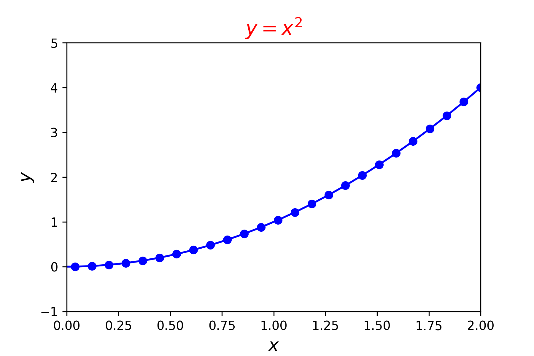
where xmin and xmax are the minimum and maximum value on the \(x\)-axis (and similar for \(y\)). To demonstrate this lets change the axis limits so that the \(x \in [0, 2]\) and \(y\in [-1,5]\). Enter the following code into your program before the plt.show() function.
plt.xlim(0, 2)
plt.ylim(-1, 5)
Run your program and you should see the following plot added to the Plots pane.
6.2.4.2. Setting the aspect ratio#
We can set the aspect ratio of the plot which controls the height and with of the axes using the ax.set_aspect() function
ax.set_aspect(value)
Here value is either 'auto', 'equal' or num as described in Table 6.2 below.
Value |
Description |
|---|---|
|
automatic; fill the position rectangle with data |
|
same scaling from data to plot units for the horizontal and vertical directions |
|
a circle will be stretched such that the height is |
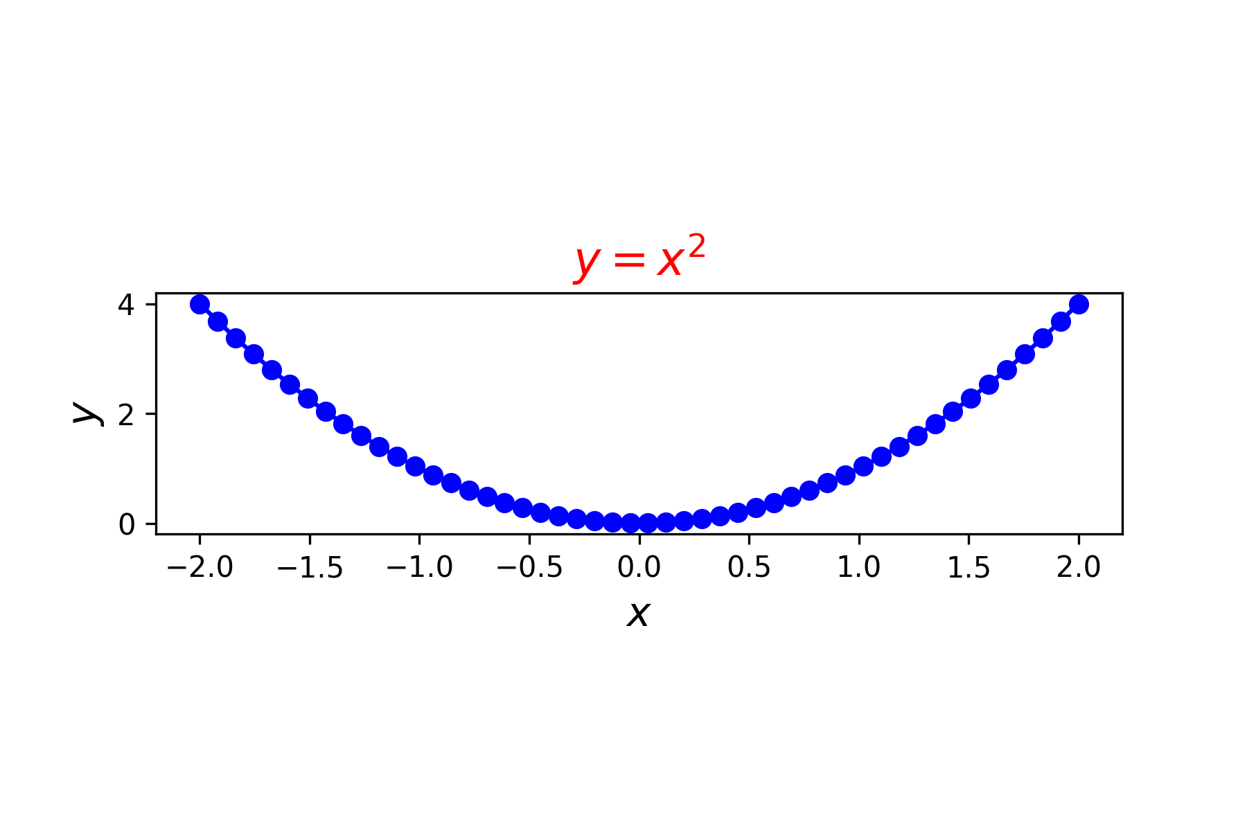
To demonstrate this lets change the aspect ratio so that the height of the axes is 1/4 the width. Enter the following code into your program before the plt.show() function.
ax.set_aspect(0.25)
Run your program and you should see the following plot added to the Plots pane.
6.2.5. Exercises#
Create a new Python file called 6_Plotting_exercises.py and save it to your OneDrive folder. Use it to answer the following exercises.
Exercise 6.1
Produce a plot fo the function \(y = \sin(x)\) with a red line using axes limits \(x\in [0, 4\pi]\) and \(y \in [-2, 2]\).
Exercise 6.2
Produce a plot of the function \(s = 2t^3 + 3t^2 - 8t + 6\) over the domain \(t\in [-4,4]\) using a green line. Scale the \(s\)-axis so that it is in the range \([-50,50]\) and change that aspect ratio to 1/20.