6.3. Multiple plots on the same axes#
To include multiple plots on the same axis simply add another plt.plot() function.
plt.plot(x1, y1) # first plot
plt.plot(x2, y2) # second plot
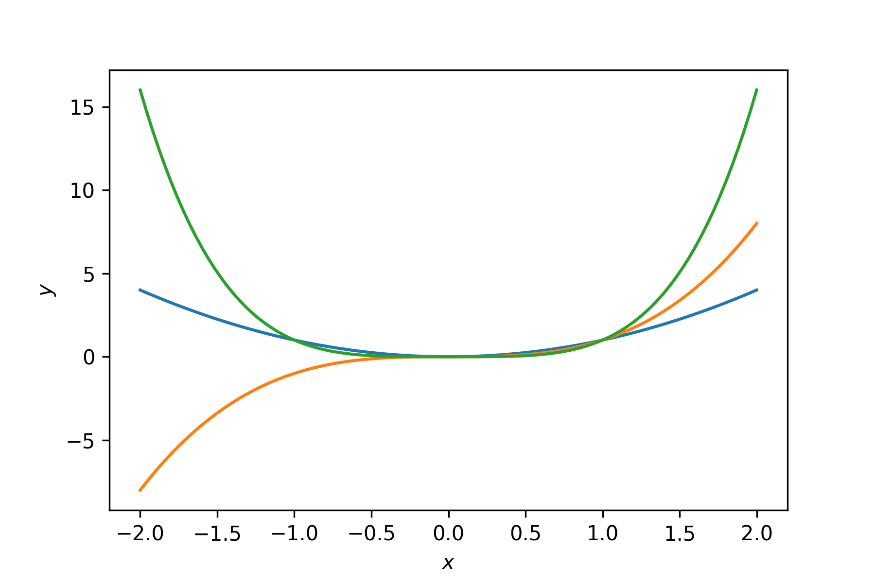
For example, lets plot the functions \(y = x^2\), \(y = x^3\) and \(y = x^4\) on the same axes. Enter the following code into your program.
# Multiple plots on the same axes
x = np.linspace(-2, 2, 100)
y1 = x ** 2
y2 = x ** 3
y3 = x ** 4

fig, ax = plt.subplots()
plt.plot(x, y1)
plt.plot(x, y2)
plt.plot(x, y3)
plt.xlabel('$x$')
plt.ylabel('$y$')
plt.show()
Run your program and you should see the following plot added to the Plots pane.

Note that matplotlib uses a different colour for each subsequent plot if the plot colour has not been specified.
6.3.1. Legends#
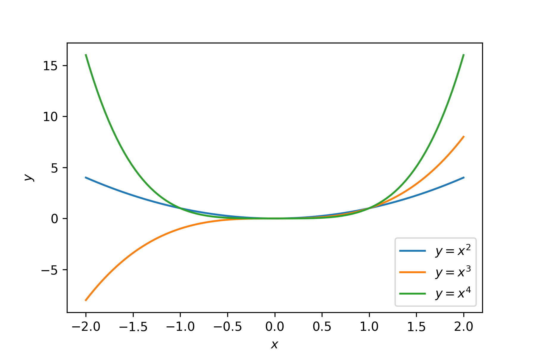
The problem with our plot of the multiple functions above is that someone viewing the plot has no way of known which line represents which function. To provide this information we can add a legend to our plot using the plt.legend() function. First we need to add a label to each of our plot commands.
plt.plot(x, y1, label='1st plot label')
plt.plot(x, y2, label='2nd plot label')
Once the individual plots have labels associated with them we can add a legend using
plt.legend(fontsize=size, loc=location)
Where fontsize and loc are optional arguments. fontsize is the size of the fon used in the legend in pt and location is a character string from one of 'upper left', 'upper center, upper right', 'left', 'center', 'right', 'lower left', 'lower center' and 'lower right'. If fontsize or loc isn’t specified then matplotlib will use the default font size of 10pt and place the legend in the best position so it isn’t overlapping the plots.
Lets add a legend to our plot, enter the following code into your program.
# Adding a legend to a plot
fig, ax = plt.subplots()
plt.plot(x, y1, label='$y = x^2$')
plt.plot(x, y2, label='$y = x^3$')
plt.plot(x, y3, label='$y = x^4$')
plt.xlabel('$x$')
plt.ylabel('$y$')
plt.legend()
plt.show()
Run your program and you should see the following plot added to the Plots pane.

6.3.2. Exercises#
Exercise 6.3
Produce plots of the functions \(y=\sin(x)\) and \(y=\cos(x)\) over the domain \(x\in[-2\pi, 2\pi]\) on the same set of axes. Use a red line for the plot of \(y = \sin(x)\) and a dashed blue line for the plot of \(y = \cos(x)\), scale the \(y\)-axis so that it uses the range \([-2,2]\) and insert a legend in the top-left hand corner of the plot.
Exercise 6.4
The \((x, y)\) co-ordinates of points on a circle centred at \((c_x,c_y)\) with radius \(r\) can be calculated using \(x = c_x + r \cos(\theta)\) and \(y = c_y + r\sin(\theta)\) for \(\theta\in [0,2\pi]\). Plot four circles centred at \((5, 5)\) with radii \(r=1,2,3,4\). Adjust the aspect ratio to display so that the circles look circular and not like ellipses.